

At Reducto, we train models to parse documents. For the most part, this is a deterministic task — ask 10 people to read a line of text or transcribe a table and you’ll probably get the same answer. Figures are the exception.
Figures are the parts of a document that communicate information visually. These can be things like images, charts, diagrams, or logos. When parsing these, we want to provide a summary that captures this information in words so that we can use it with the rest of the parse.
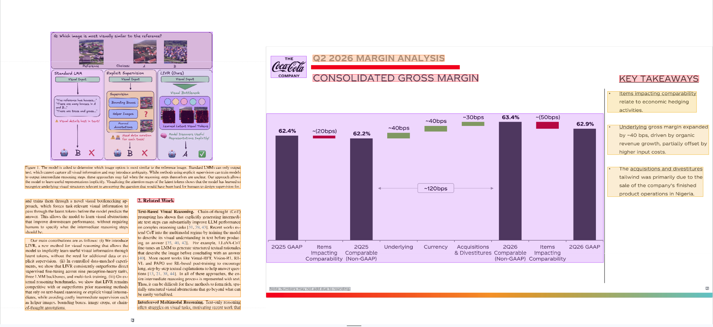
The challenge with summarizing figures is that their open-endedness leaves room for judgement. A figure could be described in different but equally valid ways, and the best summary often depends on the surrounding page context and downstream use-case. That means it’s our job as model-trainers to shape how our models behave.
In this article, we’ll provide some color on how we think about figure summaries and a few of the interesting things we encountered in the process.
Deciding what to include
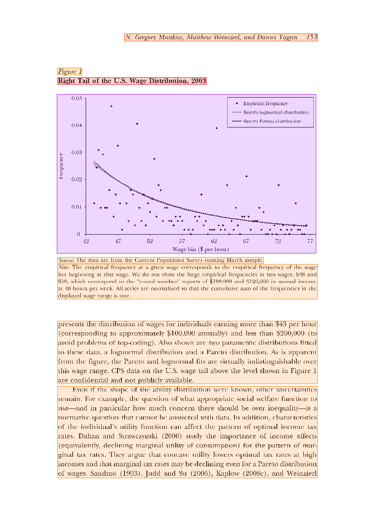
For a figure used to illustrate a trend, a useful summary might describe each line’s direction and steepness. For retrieval, it may be more useful to describe the visible elements in detail. Even then, enumerating every point in a dense scatterplot like the one above is unlikely to help. The amount and type of information should fit the task.
As a starting point, we reviewed around 2,000 figure summaries generated by different models to decide what behavior we wanted to see. While there’s no single right answer, we distilled our preferences into a few key principles.
Stay faithful to what is visible
A summary should describe the figure accurately and avoid guessing when the image is ambiguous. In one example, a summary of a barcode included text from below the figure, duplicating information elsewhere in the parse. For something like a four-stage process diagram, the summary should describe the stages. Calling it a “customer touchpoint workflow” would require explicit support from the page.
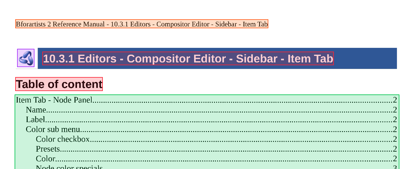
Likewise, a model that cannot reliably identify an unlabeled logo, such as the one in the top left in this example, should use a generic description such as “[Figure: Company Logo]” rather than guess the company.
Use page context to explain visible elements
Surrounding text can make a figure easier to understand, but it can also introduce unrelated detail or unsupported claims. We use context when it helps interpret something visible in the figure.
In the satellite map below, the legend sits to the left of the image. Its mapping of pin colors to categories helps explain the pins and belongs in the summary. The unit totals in that legend don’t explain a visible element in the crop, so we leave them out.
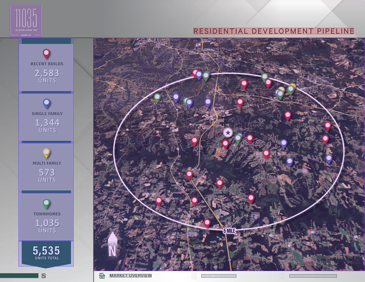
An ideal figure summary for this image might say something like:
“Satellite map of the residential development pipeline, with colored pins marking locations within a white oval labeled ‘5 MILE.’ Red pins represent recent builds, blue pins represent single family units, yellow represents multifamily units, and green pins represent townhomes. A star marks a central location, and a north arrow appears at lower left.”
For each fact brought in from outside the figure, we ask:
- Which visible element does it explain?
- Would the figure be harder to understand without it?
- Is the connection explicit enough to state as fact?
Match the length to the figure
A dense chart may need several sentences to preserve its important details. A small icon may need only a short label, especially if it mainly provides visual structure. We want the length to reflect how much useful information the figure contains.
Why error counts were not enough
Grading a figure summary on its own means deciding both whether it is accurate and whether it includes enough useful information. Several summaries can be valid, so matching a single reference is too restrictive. We started with error-based scoring, then added comparative judging to make differences in coverage easier to assess.
Our initial diagnostic evaluation used a judge model to read the page, the figure, and the summary, list concrete errors, and assign a severity to each. We combined those judgments into a score, distinguishing precision errors, such as invented details or misread numbers, from recall errors, such as an omitted detail needed to understand the figure.
We weighted precision errors more heavily because downstream systems often treat parsed output as ground truth. An invented number or a reversed sign can be harder to detect and more damaging than an omission.
But this approach led to some loopholes and degenerate behavior. The model can simply output nothing and only get penalized once for a recall error (although an extremely severe recall error!). We also experimented with length rewards, but this didn’t work well in practice, one of the reasons being that there are figures (such as logos) where we prefer brevity.
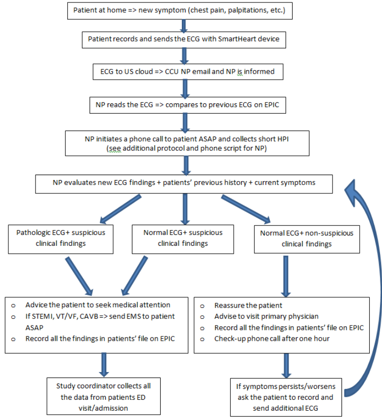
In this example, Gemini-Flash reduced this entire ECG triage flowchart to “Call work-flow”. However, the judge flagged the omission of its key steps, branches, and actions as a single high-severity error, while more detailed outputs were penalized more for each different mistake.
Comparative judging with a fixed baseline
To solve the coverage gaps of the diagnostic judge, we added a pairwise evaluation with our previous figure summary model as a fixed baseline. For each figure, a judge compares a summary from the model checkpoint being evaluated with the baseline’s summary. We measure how often it prefers the checkpoint.
The comparison gives the judge a concrete alternative when deciding whether a summary includes enough useful information. It can examine what each summary includes and leaves out. Two summaries can both be factually correct, yet one may preserve more of the information needed to understand the figure.
Our final training metric combines the diagnostic score and pairwise win rate. The diagnostic evaluation identifies specific errors and their severity. Pairwise judging helps assess which summary is more useful when several descriptions could be valid. Together, they let us evaluate factual accuracy and useful coverage.
Our upcoming parsing benchmark will revisit the same question: how to measure quality when there is more than one valid output.
Written by Chuyi Shang and the Reducto ML team. Edited by Palak Agarwal.
Additionally, if these types of problems excite you, apply to join our team on our careers page.